This simple Android gesture would make iOS 16 so much more intuitive


Read in other languages:
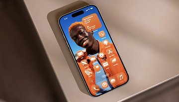
Do you prefer virtual buttons or touch gestures to navigate your smartphone interface? Personally, I'm more of a gesture type of person. Scratch that, in fact, I'm a gesture person. And after spending two weeks reviewing the iPhone 14 Pro Max on a daily basis, I miss the navigation gestures on Android. The back gesture, in particular, has become a marvel of intuitiveness in my eyes compared to the system chosen by Apple for iOS 16.
I know, I know. Antoine is still discovering the tech world, but that's also the point of reviewing products over the long term. More subtle elements of the user experience are often "forgotten" in the initial articles. We're in a hurry to publish the review out as soon as possible to grab your attention and satisfy the sacrosanct algorithms of the Divine Google, the merciful purveyor of page views and clicks.
As a result, one of the most striking negative points of my user experience on the iPhone 14 Pro Max and thus on iOS 16 is the intuitiveness or rather the ergonomics of navigation. iOS should have a gesture to go back to the previous screen, just like on Android. Well, iOS does have such a gesture, but it only works in certain apps, in selected scenarios, and in a certain way.
Am I overdoing it? Am I just a vile anti-Apple hater who knows nothing about UI design? Or is this a flaw in iOS that, for some users, can be a real deterrent to buying an iPhone?

iOS 16 has a very intuitive interface...
Even if you hate Apple and iPhones, it's hard to deny without lying to yourself that iOS has a very intuitive user interface. I'm going to sound like an absolute noob who discovered fire. But silly things like Face ID, AirDrop, multiple widget stacks, or the back tap gesture at the back of the iPhone are great.
Well, I wish Apple would implement iPadOS 16 's split screen and windowed mode features in iOS 16 so that we can benefit from them on the iPhone and not just on iPad. Overall, iOS, and especially iOS 16, offers a smooth and ergonomic user experience.
We can also mention Apple's lead in terms of accessibility. Android has certainly made plenty of progress in recent years, but iOS 16 is literally packed with options to make navigating the interface easier if you have visual, hearing, or physical/motor disabilities.

... except to go backwards
I don't understand why, in 2022, I still have to stretch my thumb to the other end of the screen to return to the previous screen. WHY?! Ok, I can understand that we can prefer to have a fixed button, but then again, why place it at the opposite extreme of the area that is accessible to your thumb (if you are right-handed, like most humans on this planet)? Why make one-handed operation more complicated than it should be?
I don't have the answer to that question. It is weird that Apple continues to go against the grain on this matter. At the time of Android 10's (Q) rollout in 2019, the two product managers of Android UI, Allen Huang and Rohan Shah, explained, among other things, that the "Back" button was used 50% more times than the "Home" button."
"So one of our design goals was to make the back gesture ergonomic, reliable, and intuitive, and we prioritized this over other less frequent navigation modes like drawers and recent apps," according to their blog post.
An obvious lack of comfort
Google engineers then performed a bunch of experiments to determine an accessibility zone on a smartphone screen. Basically, the perimeter that the user is most able to cover with his thumb without feeling discomfort.

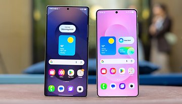
By the way, this famous coverage area was also one of the main points raised by other Android manufacturers like OnePlus, Oppo, or Samsung. They have all identified the need and even the demand of users to be able to navigate the OS of their smartphone with just one hand.
- Check out our selection of the best compact smartphones that can be used with just one hand

On iOS 16, the "Back" button is placed at the top left of the screen, regardless of the usage scenario. So we're at the antithesis of the natural comfort zone for the most ergonomic navigation possible. It's just plain stupid. You have to systematically hold your iPhone with both hands or be one of the minority of left-handed users to go back to the previous screen without risking a cramp in your thumb.
I refuse to believe that this is not a deliberate choice by Apple. We're talking about the market leader and the most streamlined and optimized UI. No, it can't be a blunder, there must be a certain type of logic behind it that we do not know of yet.
We're back to the famous magic argument that Apple doesn't do anything by chance and especially nothing by mistake. If you find something wrong, it's simply that you haven't elevated yourself spiritually enough to appreciate the relevance of this or that particular function.
Supporters of this doctrine will surely say that I am too stupid, since iOS does offer a backspace. Well, yes, it's true, but who cares because it doesn't work at all like on Android. And that's exactly what this article is about.
A question of philosophy in terms of UX?
Basically, in some applications like Safari, Settings, WhatsApp, and others, you can go return to the previous screen by swiping your iPhone screen from left to right. Yes, it works.
But it only works if the app's interface displays a new tab or page from right to left. In the Photos application, for example, a photo is displayed in full screen via an animation that begins from the bottom of the screen and goes to the top. In this case, the return gesture will not be horizontal, from left to right. Instead, it will be vertical and you will have to swipe from the top to the bottom.
While digging around online, I came across a comment from 2020 under a post in the subreddit r/iphone that was very interesting. The user explained that "It's not the most convenient thing, but that's Apple. They care more about fluidity to make sure it feels natural. Android, on the other hand, was designed with a back button. They can't do something like iOS, unless all the app developers want to rework their apps. So they can only use a backswipe to trigger the back button functionality."
Basically, it's all about consistency between animations and continuity of flow according to which UI information is displayed on the screen. By this logic, Android simply replaced a button with a gesture to activate the same function in the same way regardless of the app or scenario involved. iOS, on the other hand, implemented this gesture in a more contextual manner.
This itself is a valid argument but the problem still persists. We sacrifice fluidity of use and therefore ergonomics for the sake of visual fluidity. It's like wearing a pair of shoes one size too small because it matches nicely with your jacket, in my opinion.
Conclusion
Well, that's it. Once again, I'm glad I wasted so much electricity, Wi-Fi data, and portions of my sanity writing yet another mood post on a topic that concerns maybe 0.00002% of the population.
However, beyond the simple rant, I find this question of philosophy in terms of UI design very interesting. I would love to talk to Apple and Android developers about this (in fact, I wanted to do so before publishing this article). Even though I'm not a fan of the system Apple has adopted, I find it fascinating that there is a logical explanation for it. And I was pleasantly surprised that my research in support of my pamphlet led me to be a little less stupid and to relativize my very (too) strong opinion.
What do you think? Do you think Apple's philosophy is valid? Or should iOS copy Android and adopt a similar backwards gesture on the iPhone?
 2022 Product Image")

 Product Image")


 Product Image")


But then again even the Android implementation is rubbish, because it collides with other gestures like "swipe from left edge to center to open hamburger (side) menu". One might argue that the back gesture should then just be from the right edge, but there are some apps that also have a different hamburger menu on the other side, so the bakc gesture also collides there. On top of that there are other gestures like "swipe an item in a list to the right to trigger a item context action" (e. g. swipe to archive a mail item in Gmail) that also collides with the back gesture. I often need two or three attempts to get the desired action I want (same with the small tiny bottom bar and its different gestures)...it is so annoying