Here's why TouchWiz and other skins are bad for Android
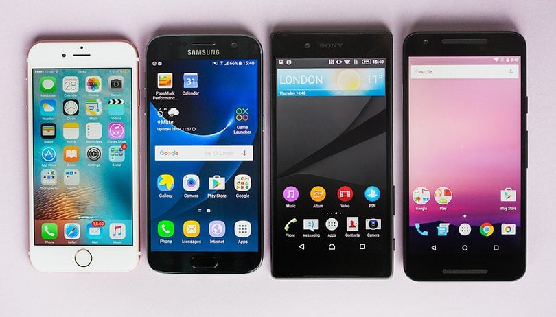

Hand an iPhone owner an Xperia or Galaxy smartphone, and their first response, I've found, is a comment on how ugly it looks. They're not talking about the design of the phone, but rather the on-screen appearance. Why are these skins such a turn off, and can anything be done to change this?
Material Design
What makes stock Android beautiful is Material Design. Announced in 2014, this was a design language developed by Matias Duarte. It was the first time Google had created a clear vision of where it was headed with Android.
During its initial development, Material Design was codenamed Quantum Paper, a name that adequately describes its aspirations: Inspired by ink on paper, but open to the strange and fantastic.
You can see this ink-on-paper inspiration when you open the app drawer: the drawer pools outwards like a drop of ink expanding over a surface before being populated with icons. But it goes deeper than that: even Google's icons are fabricated from paper and put through a lighting study before being accurately recreated in digital form.

Material Design is inspired by print-based design. This is why Google goes heavy on the cards and emphasizes white space. The colors are bold, but complimentary, with long shadows and fluid animations designed to draw attention to the most relevant aspects of a page or window.
Google is conducting wonderful, imaginative exercises in design
Today, Material Design, although still poorly adopted by many app developers, brings what an iPhone user recently described to me as "joy of use".
This comes through splashes of visual feedback. This is most evident in Google Calendar, with the seasonal images separating months, and the images that Google selects and integrates into your appointments – e.g., an image of a dish from a restaurant you're going to later tonight. Touches like this enliven and enrich the experience and involve the user.
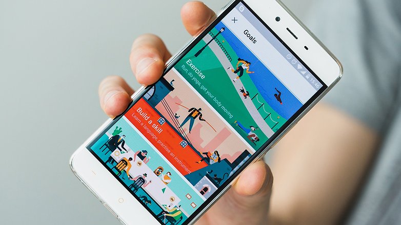
Nowhere is this more in evidence than the newly introduced Google Calendar Goals. Here, Google uses illustrations to inspire you towards a new routine or hobby. It's a wonderful, imaginative exercise in design, and it's things like this that are truly beginning to set Android apart from iOS.
Material Design vs Human Interface
What differentiates Material Design from Human Interface is that iOS has seen a migration towards an airier design language. Adopting Helvetica Neue in iOS 7 took this to the point of almost vanishing lightness. Pastel tones, gradients, and blurred, rainbow-colored backgrounds compact all of this, draining the UI of contrast.
All third-party apps in iOS sits perfectly alongside Apple's own laborious design work
It was with iOS 7 that Apple began to come under criticism and continues to suffer hilarious take downs. And Apple has since invented a new typeface, San Francisco, which corrects some problems to a degree, but the defining iOS elements remain largely intact, for good and ill.
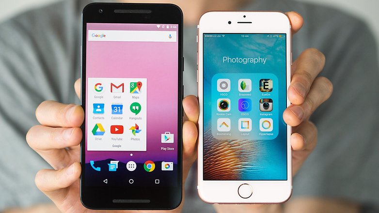
iOS has had the temporal advantage in terms of visual design, as, from the very start, Apple has kept a tight leash on the way apps appear, making everything sit perfectly alongside their own laborious design work.
Google's vision is bold, and relies on print-like layouts, cards, more movement, animations. It's an attempt to meld the appearance of print with the fluidity and magic, if you will, of technology.
I venture that Google has caught up with iOS in a very short time, and with a wider and closer adoption of Material Design by developers, Android could easily overtake Apple in terms of coherent and appealing design. But for one major obstacle.
Sony and Samsung
Turn on a Samsung Galaxy S7 – a sleek, expensive and desirable piece of technology – and you're confronted with a garish mash of color that is made all the more hideous by a brilliant display.
Samsung continues to employ its nuclear-sludge-green in combination with navy blue. These colors clash horrendously. Not only that, but blue has the biggest negative impact on an AMOLED screen, burning the pixels out most efficiently, and while black comes through impressively on an AMOLED panel, Samsung's designers often opt to use varying shades of grey, instead.
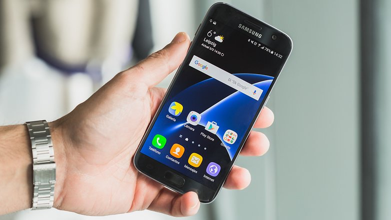
I want to make clear now that design and aesthetics are deeply personal, subjective considerations. But the more universal the language of design is, the more users everywhere benefit. Now, I think Samsung and Sony UIs are ugly. Others do not think so. My major point of contention, however, is that heavily customized manufacturer UIs like TouchWiz are detrimental to Google's vision.
Seemingly small changes made by manufacturers reject essential elements of Material Design
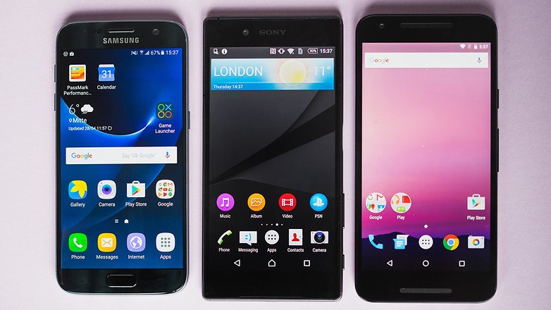
The thing is that custom skins, particularly TouchWiz and Xperia, don't really represent a customization of stock Android, they represent a rejection of the Material Design language.
Open the app drawer on a Galaxy device and the animation is a quick fade in. Open it on Xperia and it slides up. Both use transparent backgrounds. These are small changes, but they reject essential elements of Material Design.
Samsung still uses big, colorful icons that share more in common with iOS than stock Android.
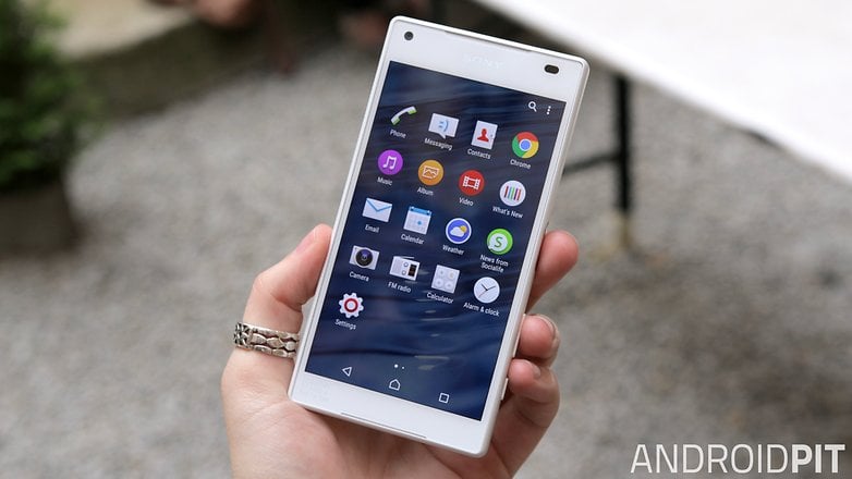
Whereas Apple moved away from using realistic, humanistic imagery between iOS 6 and 7, and Samsung also, since TouchWiz 5.0, one of the first things you will see on a new Xperia Z device is an AccuWeather widget, complete with realistic depiction of the current conditions. It's also about as far from Material as you can get. With its PlayStation Network icon, it appears Sony has even't attempted to adhere to a single element of Google's guiding principles.
These are just a very small handful of examples. There are many more.
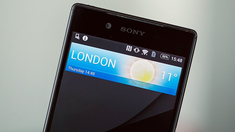
We can put these decisions down to a number of reasons: laziness, ignorance or a rejection – partial or not, the effect is the same – of Material Design. I like to think it's the latter, but whichever is true, it makes Android less appealing to people unfamiliar with it, it fragments Android, and creates alternative, incomplete design languages that to a lot of people, myself included, simply look horrible.
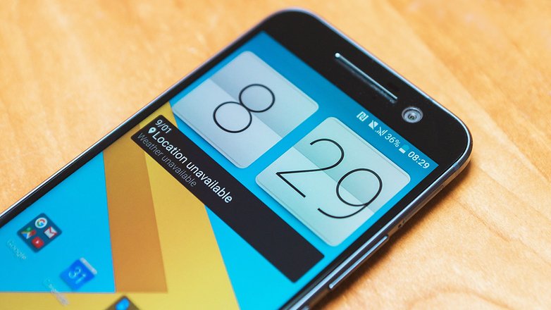
We should celebrate manufacturers like HTC, who has pruned its Sense UI down on the HTC 10 and replaced some of its own apps with Google apps. This is exactly the approach I am looking to see, and I hope more manufactures follow suit.
Do you think manufacturer skins are doing Android a disservice, or do you prefer TouchWiz to stock? If so, why? Let me know in the comments.



In my opinion...
I love the new TouchWiz UI, now it looks closely to material design, and it has great functionality. Let's don't forget theme store.
Personally I hate LG UI (I didn't see some author's comment about LG), it's cold, without sense or life. Simply I don't get it.
Huawei's UI is clearly a different approach that stay away from material design (author doesn't speak about it) but it has some interesting things.
Ending my thoughts, this article is centered in only some OEMs, there are more than Samsung, HTC, Apple and Sony.
I chose Xperia and TouchWiz to focus on because I have the most experience with them and they illustrate the point well. Some other skins are definitely as much to blame, however.
If I wanted an ecosystem that imposed rigid requirements on design, I'd get an iPhone.
TWIZ is fine. THE writer could have picked on anything but that. Who cares? Not affecting the buyers so be it. SAMSUNG hater for sure
I prefer touchwizz for functionality. Samsung is always thinking ahead. Now with themes option you can simply install a material design theme and all will look like stock but still packed with TW's features. Btw stock white app drawer is very ugly.
Touchwiz is great!I am now using Touchwiz Samsung s6 theme for my YU Yureka cyanogen os based phone its great and efficient looks neat,Pleasant and better than stock android!!!
Before I had bought my Nexus 5,I always thought that Touchwiz was tge greatest looking UI, but once I started using stock Marshmallow with it's gorgeous and soo satisfying animations I just don't want to go back to Samsung's sluggish, randomly coloured UI. Stock is amazing. And although it doesn't have themes (which I think may be added at some point as all the different manufacturers are doing it) it is still a better looking UI than most if not all the others.
touchwiz is best ui which is equaly stable to stock n its functionality is also great........after touchwiz cm rom is good........miui is best in functionaliy but not as stable as touchwiz
Personally I really dislike the the ui of nexus devices the use to much white and it's just boring.
I prefer a heavily customized rom like cyanogen os which gives me the option to make the phone look the way I want to. Unfortunately cyanogen os sucks when it comes to updates and communication but besides that it works the way I like
Same is the problem with EMUI and MIUI, they are too flashy and too colorful. A more simplistic approach like material design is required.
This write up is such a heap of rubbish, get rid of it.
You lost me when you said Xperia UI is ugly ? . Kindly delete this article hey
xperia ui is worst of all.....now dont ask me to delete my coment
TouchWiz is best android launcher
Stock launcher looks so dull !!
I wish I could get TouchWiz in NEXUS phones too..
yes i totally agree i love the way touch wiz looks especially in 6.0 the white is niceee
Your welcome to like it. It could be added as yet another launcher. But it shouldn't be forced on those who don't enjoy it but still like Samsung devices. And it could separate OS updates from Samsung's own updates. Win/ win.
Yeah, except those who swear by Nexus and "Stock Android" want to FORCE their whims to everybody by hounding the phone makers who stray from their perceived superiority like PETA hounds Seaworld because they kept Orcas...
Manufacturers' UIs and specific apps are a way they try to get more money. I really dislike the inconsistent way they implement it, fragmented and visually unappealing. What's more, it often results in a higher battery consumption due to poor optimization.
Android is nice because it allows personalization, so I use a launcher and deactivate some useless default apps.
The problem is that manufacturer's goal doesn't exactly overlap with users goal.
I doubt i will ever consider a basic 'stock' device. While materially flawed design continues to infect touchwiz, it is still more functional and more innovative. Mobile payment is better and works with more terminals than android pay, Samsung had fingerprint sensors first, has physical home button and dedicated back/task buttons, has a better email app, etc. And no, i have no allegiance to Samsung, they just make the best stuff currently despite their poor support and allegiance to the carriers.
I dislike the cartoonish and flat icons that in my view look amateur and sloppy. Apple started it with iOS 7 and now everyone else copies their ugly UI. However, i suppose the new style is web everywhere in terms of bring apps down to the level of a web site.
I have to agree with most of your post. I have been fortunate enough through the last few years to have an galaxy s4, and Lg g2, Htc One m8, and now currently using a Nexus 6. While android has gotten a more attractive, more universal look, I still prefer the skins of manufacturers as long as they are adding features. I honestly missed the dual window mode of Samsung, and I miss all the camera controls of the Lg and Htc. While stock android is clean and quick (modern hardware is making all the skins run quick as well), it sometimes gets too basic. I think there should be a medium between OEM features and a more stock look.