Why I think boring brand logos are a good idea


No matter how similar technical devices are, there is one thing we can always tell them apart: the company logo. While some companies pour vast sums of money into new, innovative logos, companies like OnePlus and Sony follow suit. Why do I think this is a damn clever move? Read for yourself!
Fancy a little game? Then let's guess logos. A simple pastime, without question, and there is hardly anyone who doesn't recognize the familiar company lettering or symbols at first glance. There are even apps that help us further develop this knowledge.
From the bitten apple, to the Windows flag, we all recognize them and know immediately what device or operating system we are currently dealing with. And I still remember how excited I was as a child when I recognized the cuddly penguin of Linux. Company logos are the calling cards of companies and should invite us to take notice. Or at least to leave our money with them. And to make sure that we do so, many companies have creatively changed their logos over the years and adapted them to modern times. But this does not apply to all of them. At least, the new logos of OnePlus and the PlayStation 5 can hardly be called particularly innovative. But does that make them worse than all the others? No, if you ask me.
The machete in the logo jungle: new is not always better
Company logos have two important functions. Through them, we should recognize the company quickly. They also serve as a visual representation of the company's image. McDonald's offers a good example. In 2009, the company exchanged its red background for a green one. The consumer should be able to see at a glance: "We are ecological. We offer healthy food" - away from pure fast food and towards 'healthy' apple pies and all this - in addition to the expansion of the product range - indicated by a simple change of color.
What works well for one company, can quickly go to hell for the next. Especially if you don't just change one color in the logo, but change the whole logo right away like the axe in the woods. With this, VW only last year got into hot water. There is hardly anything left of the 3D look, which was "in" from 2012 to 2019. To be exact, nothing at all. An image change after the exhaust gas scandal is logical, but going back to the good old days was probably not right for every VW driver.
Da warte ich die ganze Zeit auf das neue #VW #Logo und dann zeigen die nur das von 1967 🤦♂️ pic.twitter.com/LOajtyV3ch
— ePionier⚡️sᴉɹɥɔ (@ePionier) September 9, 2019
What the designers thought was a clear, concise look, at least that's what they said at the time, didn't work. And yes, the new slimmed-down version is concise and clear, but you can no longer see anything of the once strong appearance in the newly presented symbolic image. Perhaps they wanted to exercise restraint or remember the old days - quite possible. In any case, it did not go well. What the customer was left with was apparently the feeling that VW was trying to copy its old 'heroic deeds'. And, as is well known, most customers don't think much of regression.
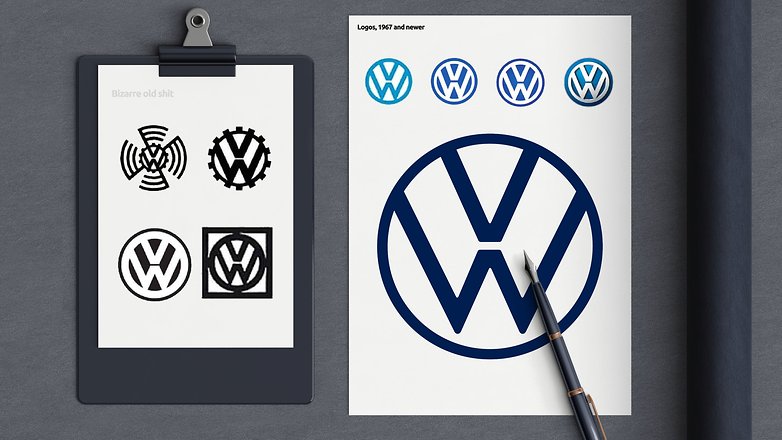
Either way, the watered-down version of the logo quickly makes the company look discouraged. Nothing remains of the original power. And probably no company wants to appear in this way. At least I haven't heard of any company that has used it to win back their customers.
It is not how much, but how well, that matters
We are not stupid. Logo designs cost money, we all know that. And there will probably be no company that simply commissions a new logo without having thought about the new layout enough before. So it's all the more annoying, as seen in the example of VW, if it doesn't have the desired success - or even gets the wrong message across. Therefore, it is important to know what the user will ultimately experience, and thus it is not really important to change much of the logo, but rather to change exactly the right points. In my opinion, Apple has mastered this leap perfectly.
For example, the first logo of the American company still showed an old-fashioned image of Isaac Newton. Not very modern for a company that produces popular iPads and iPhones today, is it? Steve Jobs didn't seem to like the logo either, because after all the bitten apple we all know has been decorating Apple's product lines since 1977. From that time on, the logo only changed in color. The popular fruit remained the same. And even the decision from the rainbow-colored apple to a set shade of grey makes an incredible amount of sense to me. Because let's be honest - a pink, winking apple would look stupid on the products and would certainly not attest to the brand any seriousness.

Apple has certainly not been harmed, because the timeless apple combines the best of both worlds: Newton's ingenuity in ignoring known laws and modernity through the simple design. Sure, this is just my interpretation of the logo, but we can be sure that Apple wants to represent the innovative and creative company of today and the future.
If it ain't broke, don't fix it
That's the English saying and many companies would be well advised to take it to heart. Because yes, even with company logos we decide whether a brand appeals to us or not. And above all, how we perceive their own self-image. VW has shown that too much change can quickly suggest to the user that a company is at a standstill. And certainly, Apple transformed its Newton image into the iconic logo of today. But since that point, the company has remained true to itself, and with good reason. The company has remained modern - logo-wise - by adapting its colors. But the apple also indicates that Apple has remained true to itself. It suggests that it stands by what it does and radiates confidence. A trust that users have been relying on for many years - so why change it?
So now we have OnePlus and Sony with its PS5, doing exactly the same thing as Apple did back in 1977, not interfering with a system that's already running well. Instead, they adapt it to modernity with small tweaks. At the same time, they tell us with their logo choice: "The customer gets exactly the same high quality as before. Nothing changes, except that we have become more modern". A promise that, in my opinion, creates trust. Because if you've loved PlayStation consoles before, you'll be told nothing more here than: "You don't lose any of the good bits of the old product. It just gets better, and newer."
In the end, small changes usually stand out much more than the really big ones. Because as customers we still recognize the company behind the brand. After all, a company with which we have been overcoming many good and bad times for years in some cases. Instead of really groundbreaking new designs, I would like to see the backbone of other logos, too, to be aware of its own strength. And to keep them in their logos!
 2022 Product Image")

 Product Image")


 Product Image")


Well, you finally ran out of subject to write about.
-
Admin
Mar 25, 2020 Link to commentIt certainly shows how messed up our values are when the logo is more important than the products